

Introduction
This is a short article meant to demystify the workings of a javascript file upload component. I've had to implement this in many different applications, and used pretty much all of the solutions out there. Some are great, others are overkill at best. I ran into the situation quite often that a much simpler solution would've saved me time while implementing, but also when maintaining. This article aims to show you how easy it can be to implement a file upload solution in Vue 3 yourself, and have more flexibility over all the options.
Often used solutions include some form of validation, allowing to delete uploaded files, drag and drop uploads, and support for multiple files. So we are going to build those features.
For this article I assume you have already set up a Vue 3 project, since I am always annoyed by articles that spend 50% of their content on setting up a default project. Straight to business here.
We start off with creating a new Vue Component. I called mine Uploads.vue and I put in components folder where it will be auto imported by Nuxt.
Starting simple
So let's start with the simplest solution we can find: A file input
The code would look something like this
<template>
  <div>
    <input
      ref="input"
      type="file"
    >
    <button @click="uploadFile">
      Upload
    </button>
  </div>
</template>

<script setup lang="ts">
const input = ref<HTMLDivElement>()

const uploadFile = () => {
// make a request
}
</script>
All fine and dandy so far. This is a good base to built on. What we're going to do first, is explore the options to add support for drop zones. This feature will enable the user to select one or multiple files, drag them over the input and upload them straight away.
Drag and drop support
To do this, we need drag and drop support. But that's super difficult right? Wrong. We are going to reach for the dropzone from vue-use. A super lightweight dropzone that does this, and only this: https://vueuse.org/core/useDropZone/#usedropzone
It's 629B at the time of writing, so super small. Make sure you install @vueuse/core.
Essentially what we're going to do is wrap a large div container around the input field, catch the dragged and dropped files from there, and forcefully put them in the input field.
<template>
  <div
    ref="dropZoneRef"
    class="col-span-full"
  >
    <div class="text-center">
      <div class="mt-4 flex text-sm leading-6 text-gray-600">
        <input
          ref="input"
          type="file"
          multiple
          name="file-upload"
          class="sr-only"
          @change="(e) => onFileChange(e)"
        >
      </div>
    </div>
  </div>
  </div>
</template>

<script setup lang="ts">
import { useDropZone } from '@vueuse/core'

const dropZoneRef = ref<HTMLDivElement>()
const input = ref<HTMLInputElement>();

const onDrop = (files: File[] | null) => {
    void handleFileChange(files ?? [])
}

const onFileChange = async ($event: Event) => {
    const target = $event.target as HTMLInputElement;
    await handleFileChange(Array.from(target.files ?? []));
}

const handleFileChange = async (files: File[]) => {
// send the files to your backend
}

const { isOverDropZone } = useDropZone(dropZoneRef, onDrop)

</script>
Okay, lots to unpack here but bear with me. It's not difficult at all. First off, I added some tailwind classes for styling. You don't have to use it and you can definitely bring your own style.
As you can see in the script part of the component, the dropzone does the heavy lifting. With isOverDropZone, we get a boolean that turns true when the user hovers of the dropzone. We'll use it for styling in the next step. The onDrop is the callback that we put in that will get triggered when the user drops the file.
This boolean, we can use to give the user an indication of dragging and dropping. If the boolean is true, add a green border; else make it gray. This is really easy with Vue dynamic classes and would look something like this:
<template>
  <div
    ref="dropZoneRef"
    class="col-span-full"
  >
    <div
      class="flex justify-center rounded-lg border border-dashed border-gray-900/25 px-6 py-10"
      :class="[
        isOverDropZone ? 'bg-gray-300 border-green/25 border-2' : 'bg-white',
        errors.length > 0 ? 'border-red-600' : 'border-gray-300'
      ]"
    >
      // the rest of the component
    </div>
  </div>
</template>
I have also added a ref with errors, that we can use to show a red border.
Now most of the validation I handle in the backend. If the function handleFileChange returns any errors, I put them in the errors ref and it will automagically show a red border around the input, indicating something went wrong. You can also show some text below the input.
Adding customization props
At the moment this component is already quite useful, and definitely resembles a full fledged upload component. However, there's a few things that are missing. When you want to reuse this component in multiple places in your application, you probably want to configure some of the values of the component differently each time you reuse it. That's were props come in, to set some of the rules and boundaries of this component.
I use the following props for this component: accepts and maxsize. There are quite a few more props I can think of, but I want to keep this fairly simple for the sake of this article. The prop definition looks like this:
const props = defineProps({
    maxsize: {
        type: Number,
        default: 30000000
    },
    accept: {
        type: String,
        default: ''
    }
  })
I use both props to display the information for the user, and don't use them for validation at all. Maxsize is pretty self explanatory and accepts is just a string saying: This component accepts '.pdf, .png and .jpg' in a label like manner.
Wrapping it up
Okay, we've covered quite a lot of ground. The component so far looks like this:
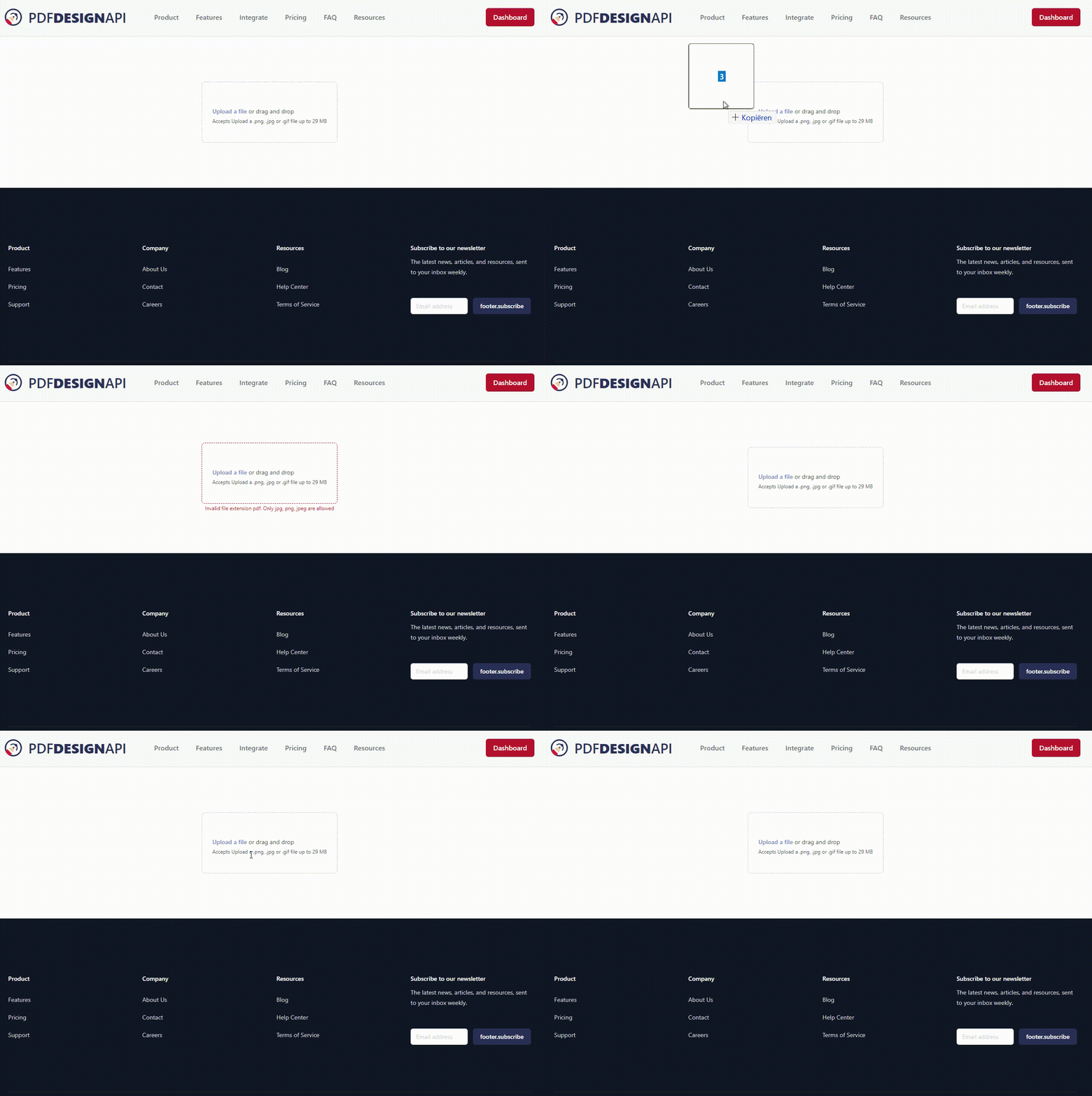
And the code looks like this:
<template>
  <div
    ref="dropZoneRef"
    class="col-span-full"
  >
    <div
      class="flex justify-center rounded-lg border border-dashed border-gray-900/25 px-6 py-10"
      :class="[
        isOverDropZone ? 'bg-gray-300 border-green/25 border-2' : 'bg-white',
        errors.length > 0 ? 'border-red-600' : 'border-gray-300'
      ]"
    >
      <div class="text-center">
        <div class="mt-4 flex text-sm leading-6 text-gray-600">
          <label
            for="file-upload"
            class="relative cursor-pointer rounded-md font-semibold text-primary-400 focus-within:outline-none focus-within:ring-2 focus-within:ring-primary-700 focus-within:ring-offset-2 hover:text-primary-300"
            @click="open()"
          >
            <input
              ref="input"
              type="file"
              :accept="accept"
              multiple
              name="file-upload"
              class="sr-only"
              @change="(e) => onFileChange(e)"
            >
          </label>
        </div>
        <p class="text-xs leading-5 text-gray-600">
          {{ accept.length > 0 ? `Accepts ${props.accept} up to ${useFileSize(props.maxsize)}` : '' }}
        </p>
      </div>
    </div>
    <p
      v-if="errors.length > 0"
      class="text-xs leading-5 text-red-600 w-full text-center"
    >
      <span
        v-for="error in errors"
        :key="error"
      >
        {{ error }}
      </span>
    </p>
  </div>
</template>

<script setup lang="ts">
import { useDropZone } from '@vueuse/core'
import { AxiosError } from 'axios';
import { useI18n } from 'vue-i18n';

const props = defineProps({
  maxsize: {
    type: Number,
    default: 30000000
  },
  accept: {
    type: String,
    default: ''
  },
})

const emit = defineEmits({
  uploaded: () => true,
})

const { t } = useI18n()

const dropZoneRef = ref<HTMLDivElement>()
const input = ref<HTMLInputElement>();
const errors = ref<string[]>([])

const onDrop = (files: File[] | null) => {
  void handleFileChange(files ?? [])
}

const onFileChange = async ($event: Event) => {
  const target = $event.target as HTMLInputElement;
  await handleFileChange(Array.from(target.files ?? []));
}

const handleFileChange = async (files: File[]) => {
  errors.value = []
  if (files.length === 0) return;

  for (let file of files) {
    try {
      // Make a request to your backend here
      emit('uploaded');
    } catch (e: unknown) {
      const error = e as AxiosError
      if (error.response?.status === 422) {
        const validationError = ((error.response.data as { errors: unknown }).errors ?? []) as { field: string, message: string }[]
        errors.value.push(...validationError.map(e => e.message))
        return
      }
      if (error.response?.status === 413) {
        errors.value.push(t('ui.upload.error.file_too_large'))
      }
      throw new Error(error.message)
    }
  }
}

const { isOverDropZone } = useDropZone(dropZoneRef, onDrop)

const open = () => {
  input.value?.click();
}
</script>
I hope this component give you a good base to built up on. If you have any idea's to improve this or have any questions about implementation, please drop me a message!